Charts: everybody loves them, but not so many know how to properly used them. This project is an extension of the Ericsson Design System (EDS) intended to provide a library with the most common charts to be used alongside with the rest of the design system.
The project started as a request from a data visualization heavy product such as Ericsson Expert Analytics (EEA), where they deal with large quantities of data. Soon we realized that the demand for a consistent and coherent chart library aligned to the design language of the company's new brand didn't stop there, and decided to work on such a project that could be used by any product.
In occasions, this questions raised up from different development teams. "Why should we invest time and money in yet another chart library, when there are so many out there?". It is very true that there a numerous solutions free or with almost no cost. Limitations associated with this approach comes down to:
A robust, branded and company owned data visualization library provides a winning strategy in the long term. Moreover the cost on doing so will payout since all teams can contribute to it instead of adding features to their own particular solutions.
The main purpose of these charts was to cover the different needs existing in dashboards from web applications. Even though this was the case, it soon became as a reference for other purposes given the great reception within the company.
Having such a wide range of operation it was important to address the most commonly used set of charts first, while at the same time making sure that they where used correctly. This required some previous research on what type of charts were necessary to cover user's needs and requirements.
Most dashboards have a common set of values:
These values influenced the way dashboards, and in consequence data visualizations, in their behaviour, interaction, etc. Not only their user experience was paramount, but it was important to push the company's brand further to make it a differentiator against the competitors by also being visually appealing.
There are many types of analysis possible. Below is a diagram that shows multiple charts and grouped by identified needed types of analysis.
Notice, that all groups derive from a common question: What kind of analysis are you targeting? This is the first and most important question when deciding what chart you need. One can think of a dashboard as a tool that solves a specific problem. It is very important to know what kind of problem are you trying to solve before choosing which tool you need.
The second question to make, before choosing a chart is: What type data do you have? In multiple occasions, users run directly to pick a donut chart and a map without even considering what information they have available.
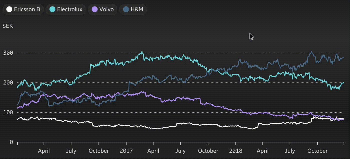
To encourage users to ask themselves these questions before choosing a specific chart, there was an Overview page that resembles the previous diagram in an interactive way. In this page, users can filter the charts shown by selecting 1) the type of analysis and 2) the type of data. By default all the charts are shown, which make this page at the same time to also works as a gallery. Each chart is represented by a card with a visual reference, grouped by type of analysis and tagged with the type of data required. Below is a small sample of these cards.
As with any other pattern, each chart is documented meticulously following the principles described in the Ericsson Design System page. It might be interesting to point out some features in the development and design of the data visualization library.
As mentioned before, there are multiple chart libraries out there, but not many of them have a responsive behaviour out of the box. Responsiveness is a key value in any modern design system, hence it's data visualization library should follow.
When creating the library, the different sections of itself were done it a modular way, so that they could be reused in other charts with similar sub-components. For example: axis, legends and pills, tooltips or even the color palette are common elements that are shared between different charts.
Similarly to Reusability, the data formatting should be coherent giving a familiar sensation to the users and the possibility to reuse any data encoding scripts done throughout their products.
Example of use of color to convey meaning: values under the red threshold have negative connotations associated to them.
Color, area and length are attributes that humans naturally associate with different values. Data can be encoded differently with a purposeful use of colors. For example, use of traffic light colors for different levels of severity, leaving neutral colors for the rest (always with color-blindness in mind).
As any other UX pattern, when stressed with the use of real data is when you see it's real value. For this reason, and to provide a correct reference of a potential use for a specific chart, real data (related as much as possible to the nature of the technical company) was used.
There are well accepted best practices that are encouraged throught the library documentation: using 0 as a reference, ordering categories by a meaningful value, using same axes when comparing charts, etc.
Color, area and length and natural attributes that humans percieve and associate with different values. There is much more potential with data visualizations since we can interact and even relate data between them, filter data, etc.
In any case, interaction patterns should always: