Key lessons I learned creating EDS
1. Lead by example
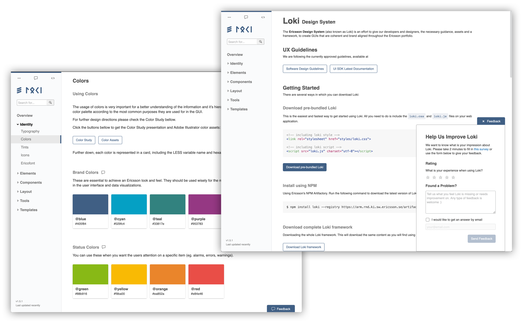
Seeing is believing Providing live examples instead of static images of components and patterns, gives users a better understanding of how that particular component or pattern works. For example, users can experiment with the way components react to responsive behavior (by stretching and squeezing the browser window). At the same time this practice removes a lot of unnecessary and boring documentation.
Eat your own dog food With the introduction of a new brand, there were naturally no references from existing products using it. This created an additional challenge for products that wanted to learn about the migration to the new brand. This problem was no exception for EDS. As new components were created the portal itself was being built, and it seemed like a good idea to start using the design system patterns and components themselves to provide the content. This created an immediate reference for users, as well as a live "testing" environment.
Small delicious bites A big part of EDS, is the collection of components and patterns one can pick-and-choose from as if it was a huge buffet. In this way, users can add to their project directly from the portal by a copy & paste (as code or design resources). This will also encourage users to come back and check if an existing similar pattern can be used the next time they need one.
2. Single source of truth
One single platform To make EDS the go-to place, it was important to have a single portal where all roles involved in the creation of front-end applications could meet, a single "source of truth". This will reduce the number of inconsistencies and potential duplicates that one can face when dealing with multiple parallel websites, simplifying the process for everyone.
Downloadable portal Offering the option to download the EDS portal on your computer provides benefits to different users:
- Agencies to gain access to EDS without the need to connect to the company's internal network.
- Contributors that want to share their work could do it directly in the same code base, simplifying the process.
- Anyone who wants to use the portal as a reference.
Common Foundations Alignment and consistency between products can be an issue in a big company's portfolio. Components and patterns provided in EDS had to be generic enough so any product could use them. However, that doesn't mean that they will all use them in the same way. In addition to guidelines on when and how to use these, I created a set of common background rules. These were inspired by Brad Frost' atomic design, and I ended up naming them "Foundations".
3. Keep a low learning curve
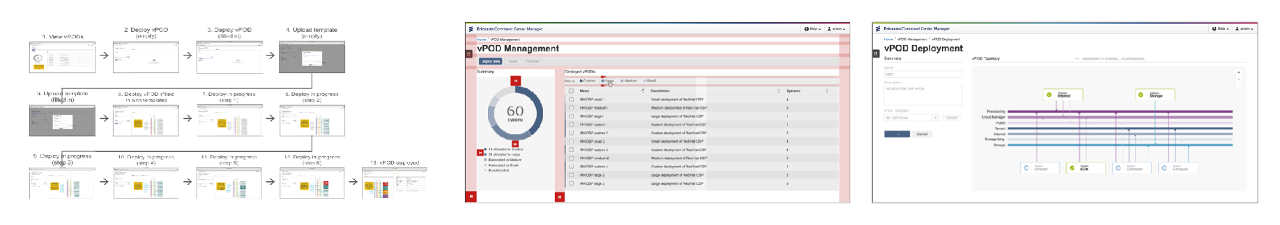
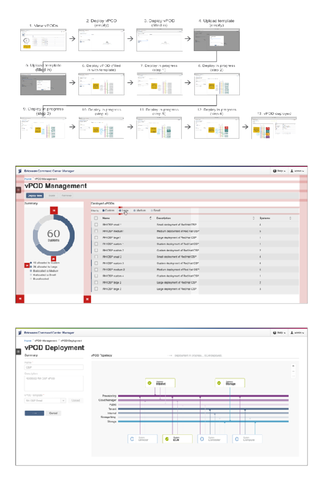
Baby steps At the top of the page users will have an overview of the component or pattern and can immediately see the default or most common use case. Engaged users will continue reading down the page. Each feature is described one at a time, gradually incrementing the complexity building on top of the previous step. This makes it easier to understand complex patterns.
Guidelines for everyone In many occasions, members of the same team using EDS are the ones designing and developing. In this scenario, providing content for both designers and developers side by side is beneficial. This also allows designers to learn technical details, as well as developers to learn usability best practices. This encourages collaboration by enabling discussions between multiple disciplines.
Easy to adapt solutions Most projects do not start from scratch, but they rather adapt existing solutions to the new brand. To make this transition as easy as possible it's important that the deliverables are self-contained, modular and can be easily modified and adapted to their own requirements.
Promote industry standards Encouraging best practices to contributors to follow industry standards and common patterns is a way to save a lot of time (and headaches) when "creating" new components. In addition, this speeds up the way they are consumed and understood, enabling contribution and simplifying documentation.
4. Users in the center
Solving real problems It's imperative to make sure to understand user's problems and needs, in order to focus on solutions that matter. To do so, it is always time well spent to see and experience real products, making sure to perform with frequency a reality check.
Be accessible Always keep an "open door" to feedback with an easy-to-reach approach. An example of this is to provide a no-registration-needed communication channel such as a chat, where the users don't feel afraid of asking questions.
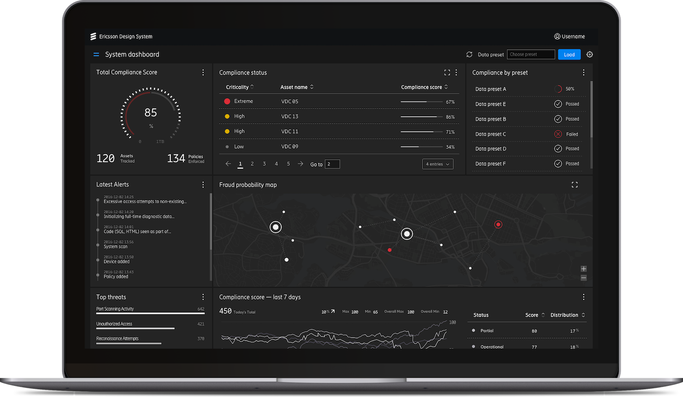
Using real data Users can relate with examples that show real data and provide more value than examples using dummy data. This provides an indirect learning by reference method.
Technology agnostic In today's front-end ecosystem, there is an overwhelming number of solutions. In a large company like Ericsson, this is no exception. To provide a solution that will fit multiple teams, the best option is to deliver the code components using vanilla JavaScript (no specific framework). In consequence, this makes it possible to be easily integrated with the majority of front-end alternatives.
Responsive solutions Products in a large company have very different audiences and use different viewport sizes. The same solution has to be able to adapt from mobile web applications to, demos pitched in tablets all the way to large screens used in Network Operation Centers (NOC).